
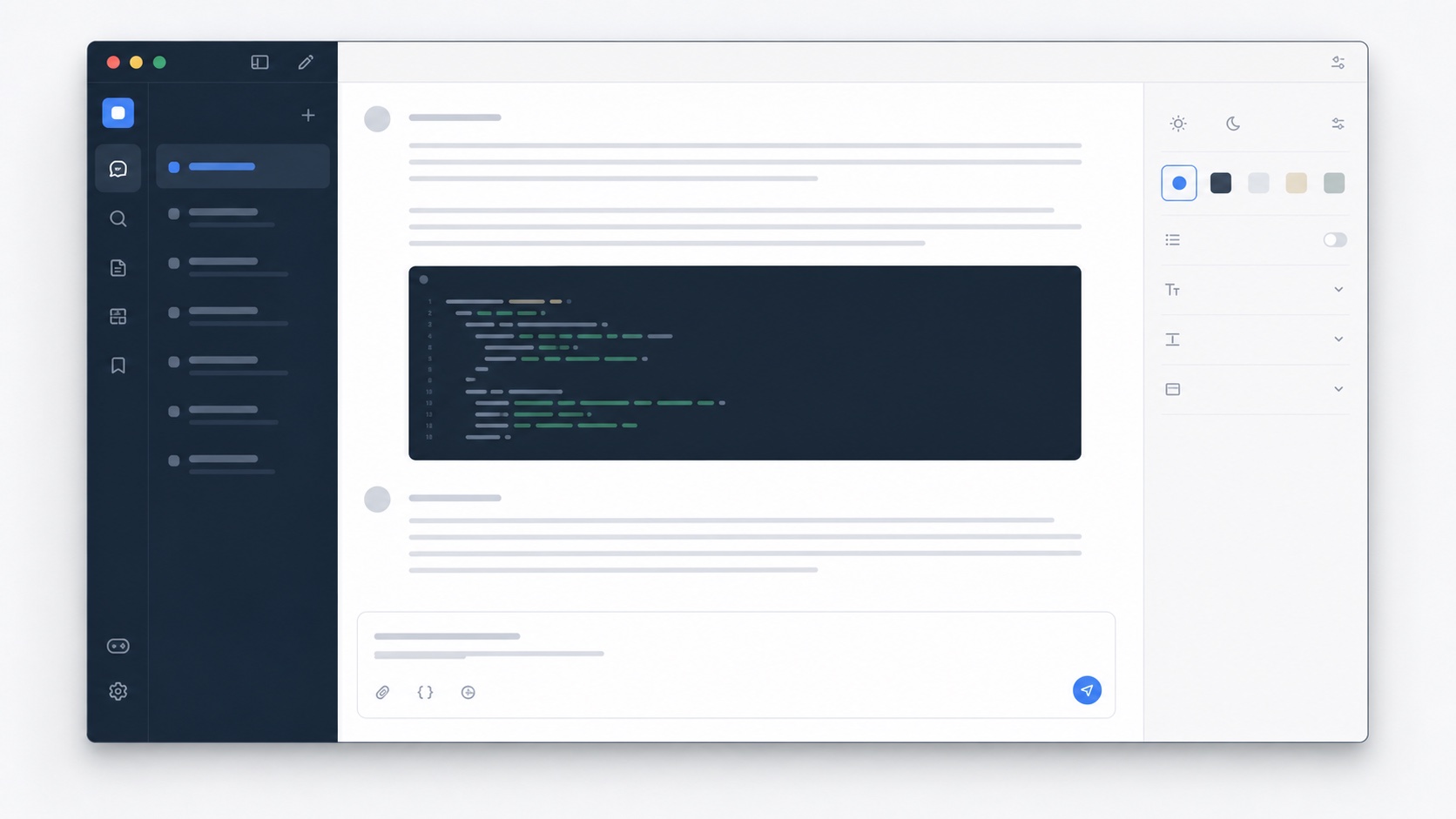
Different answer formats need different amounts of space
Prose is easiest to follow when the eye does not travel too far before returning to the next line. Code and tables behave differently. A narrow code block forces horizontal scrolling, and a narrow comparison table wraps labels until the structure becomes hard to scan. A useful wide-screen theme increases the container available to structured content while keeping ordinary paragraphs inside an inner reading width. It treats width as hierarchy instead of one global number.
The current SiteSkin adapter applies a wider supported region and coordinates the surrounding page, sidebar, and composer so the extra space feels intentional. Code Desk pairs that layout with denser technical typography, while Writing Room uses a calmer text rhythm. Both avoid changing the conversation itself. The answer remains the same response supplied by the service, only presented with a different local layout.
Large monitors should improve comprehension, not only scale
A 27-inch or ultrawide display creates an opportunity to keep more context visible. A user can see the prompt, a long answer, and the composer without constant horizontal or vertical movement. But filling every available pixel makes controls feel disconnected. The sidebar, main response, and utility actions still need a coherent relationship. A theme can reduce side chrome, center the work area, and use the recovered space where it helps most.
This is particularly useful for developers reviewing code, analysts reading structured comparisons, writers editing long drafts, and researchers extracting details from several sections of one response. The wide setting is optional because smaller laptop screens may not benefit. Responsive CSS inside the adapter allows the presentation to fall back gracefully rather than forcing a desktop measure onto every viewport.
Pair width with typography and focus controls
Width alone does not create a better workspace. Line height, paragraph spacing, code contrast, composer size, and sidebar visibility all influence how the page feels. A well-designed ChatGPT wide-screen skin coordinates those decisions. SiteSkin manifests use design tokens for surfaces and text plus explicit switches for wide content, density, and focus. That is easier to inspect than a large stylesheet with unrelated values spread across dozens of selectors.
Users can select a reviewed theme and refine the supported content width, font, background, and sidebar settings in the appearance Studio. Check a short exchange, a long answer, and a conversation containing code before keeping the result. The controls do not change message content or model behavior. They operate only on the supported presentation areas, and the browser extension remains responsible for validating the saved preferences and applying them locally.
Evaluate ChatGPT wide screen behavior with mixed answer formats
Open a realistic conversation containing short prose, long paragraphs, headings, nested lists, a wide table, code with long lines, command output, equations, citations, images, file references, and tool results. The outer conversation region can use more of the monitor, but each format still needs an appropriate inner measure. Prose should remain easy to track from one line to the next, tables should expose useful columns before wrapping, and code should preserve structure while allowing intentional horizontal overflow. Check copy controls, selection, links, citations, expand actions, feedback controls, and the composer so the wider layout does not separate an action from the content it affects.
Resize from an ultrawide display to a laptop window, increase browser zoom, open and close the conversation sidebar, and test a newly streaming answer. The layout should respond without horizontal page scrolling, clipped menus, detached overlays, or sudden jumps as new content arrives. Compare ordinary and wide modes using the same conversation rather than two unrelated examples, then decide whether the additional width improves the actual task. Developers may value code visibility, analysts may value tables, and writers may prefer the standard measure. SiteSkin keeps ChatGPT wide screen optional and reversible because maximum width is not universally better. A successful configuration uses available space selectively and returns gracefully to the original interface when the display or task changes.
Save the chosen variation only after its composer, dialogs, and long-answer controls remain reachable at the intended browser zoom.
Frequently asked questions
Will wide screen make every paragraph stretch across the monitor?+
The theme expands supported content regions but can keep an inner readable measure for prose. Exact behavior depends on the current site adapter version.
Does it work on small screens?+
The adapter uses responsive rules. On narrow screens the layout remains constrained rather than forcing a desktop width.